


Following the Ant Design specification, we developed a React UI library antd that contains a set of high quality components and demos for building rich, interactive user interfaces
✨Features
🌈 Enterprise-class UI designed for web applications.
📦 A set of high-quality React components out of the box.
🛡 Written in TypeScript with predictable static types.
⚙️ Whole package of design resources and development tools.
🌍 Internationalization support for dozens of languages.
🎨 Powerful theme customization in every detail
Sources: ANT Design
I found out ANT Design is a smart option to design our web applications using react. It provides us with high quality components. If you read the documentation provided by ANT and observe its demo of different features, you will find ANT as the better option for your application. So we will be developing a simple react application using following ANT Components.
ANT Components
There are a lot of beautiful and useful components provided by ANT Design. But I will brief you about some of the basic components that we will be using to build a system with React in this article.
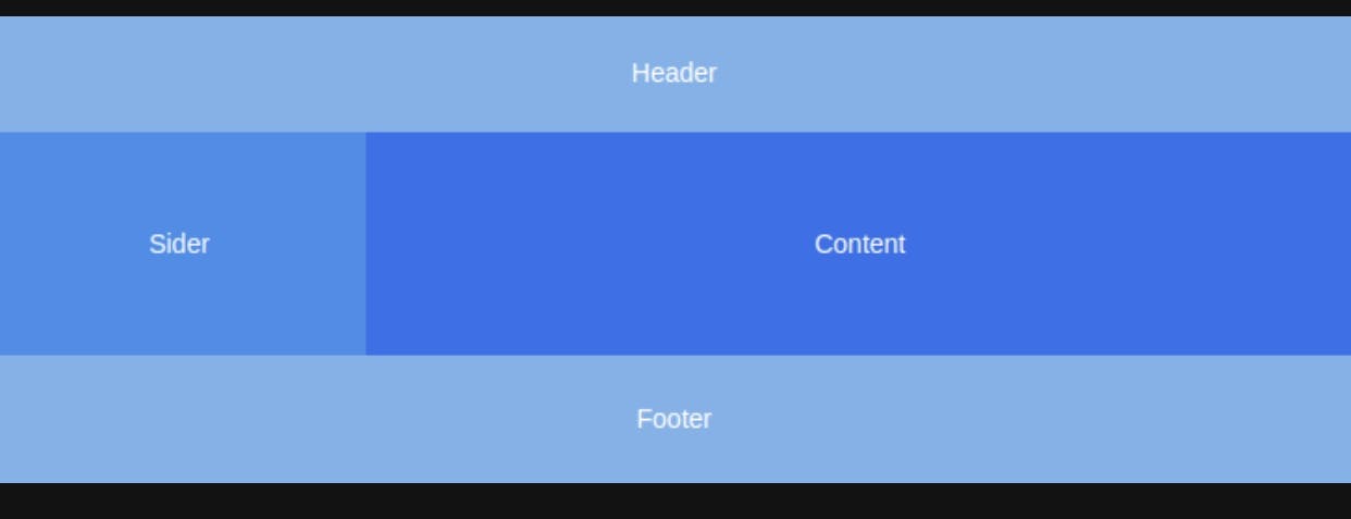
1. Layout
Layout is basically a wrapper, which consist of Header, Footer, Sider, Content and layout itself. You can modify plenty of stuff for your layout. Please refer to layout documentation of ANT for more information.
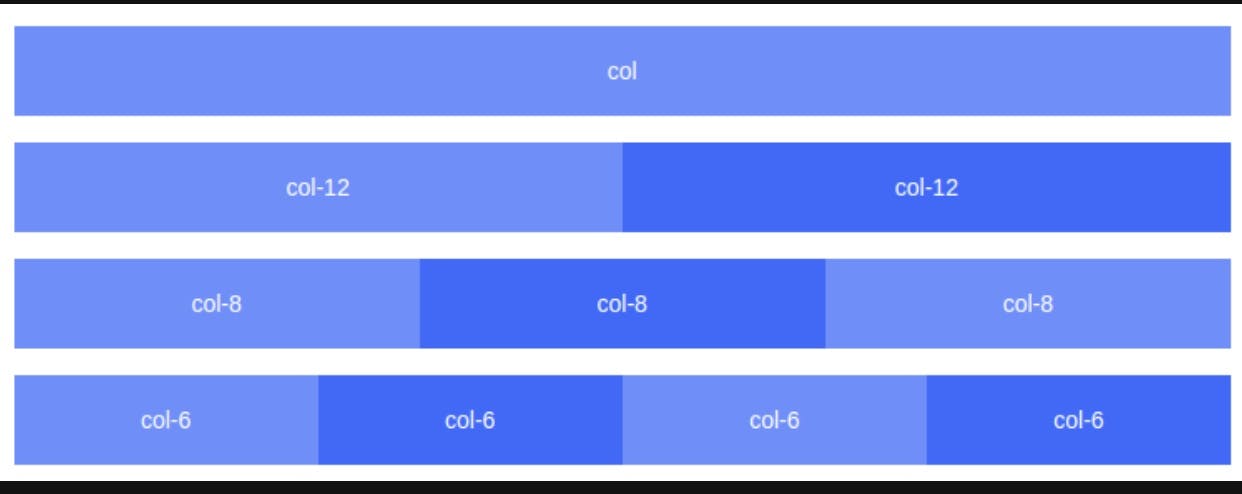
2. Grid
ANT Design has a 24 Grid System.The column Grid system in ANT Design has a value of 1–24 to represent its range spans. You can use Row for rows and Col for columns and you can have 24 columns in a row. You can define a col span like for columns of three equal widths. For more information check the Grid .
3. Form
ANT provides high performance Form Component with data scope management including data collection, verification and styles. Learn more about forms here .
4. Input
It is a basic widget for getting the user input as a text field. You can use input group, text area, format tooltip input and many more from input. Keyboard and mouse can be used for providing or changing data. Learn more here .
5. Radio
Radio is Used to select a single state from multiple options. The difference from Select is that Radio is visible to the user and can facilitate the comparison of choice, which means there shouldn't be too many of them. You can check out different use cases of Radio in Ant from here .
6. Switch
You can use switch if you need to represent the switching between two states or on-off state. The difference between Switch and Checkbox is that Switch will trigger a state change directly when you toggle it, while Checkbox is generally used for state marking, which should work in conjunction with submit operation. I was really impressed with the pending state implemented in switch by ANT. To learn more about switch by ANT, please refer here .
7. Slider
Slider component is used for displaying current value or the range of the value. ANT provides the better component for using Slider. Learn more here .
8. Select
Select component allows us to select a value or set of values from the options available to us. A dropdown menu for displaying choices - an elegant alternative to the native element. Utilizing Radio is recommended when there are fewer total options (less than 5). Learn more here.
9. Message
We use message to display global messages as feedback in response to user operations - To provide feedback such as success, warning, error etc. A message is displayed at top and center and will be dismissed automatically, as a non-interrupting light-weighted prompt. Learn more here .
10. Table
A table displays rows of data - To display a collection of structured data. To sort, search, paginate, filter data. Learn more here .
11. Empty
It is an empty state placeholder. You can use Empty when there is no data provided, display for friendly tips. User tutorial to create something in a fresh new situation. It gives good user experience as well. Learn more here

We touched the basic components we will be using for this project. So, let's create a new react project.
Create React App
We will create a new react project named react-ant with typescript.
npx create-react-app react-ant --template typescript
cd react-ant
npm install --save typescript @types/node @types/react @types/react-dom @types/jest
Install React Router
We will be using React Router to navigate to different pages of the application. This is how to install it;
npm install --save react-router-dom
npm install @types/react-router
Install ANT Design
Finally, we install ANT Design to our system with following command;
npm install antd
Also import antd css to the index file, index.tsx
//src/index.tsx
import 'antd/dist/antd.css';
Create Fake Json Server
We will be using the Fake Json Server for storing and retrieving our data locally. I am using it because our application is small and we will be storing and retrieving the data later on. Install Json Server with following command;
npm install -g json-server
Create a folder named Server and in it create a file named db.json to record our data. Then create a users collection in db.json which will be holding our users data later.
{
 "users": []
}
Next thing you need to do is to create json-server.json file to the root of the project and it will hold port of our server.
{
"port": 5000
}
To run the json server, you run the following command on your terminal. Keep your server running
json-server --watch server/db.json
Install Axios
Axios is the promise based HTTP client for the browser and node.js. We will be using Axios as well in the application. So let's install it;
npm install --save axios
Create Layout
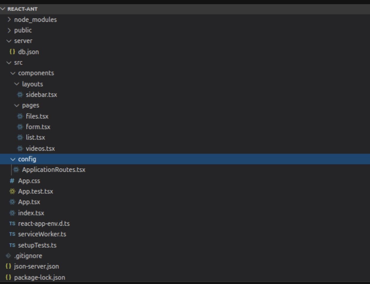
We start by structuring our application with files and folder. First, we will create two folders inside src and give them the name components and config respectively. Add route configuration and layout in config folder and different pages and layouts in components folder. I am going to provide the screen shot of files and folder that we are going to create.
Also delete the unnecessary files and logos that we will not be using from the project. Now we will start our code with App.tsx.
// src/App.tsx
import React from 'react';
import ApplicationRoutes from "./config/ApplicationRoutes";
function App() {
  return (
    <ApplicationRoutes />
  );
}
export default App;
We define our route for different pages and layout on the ApplicationRoutes.tsx file. I have included all the routes, but you can add these routes after adding the components if you don't get an error. I have also included the header, Sider and content components to form layout. You can separate them as well, if you want cleaner code. The code is below;
//src/config/ApplicationRoutes.tsx
import React, {useState, useEffect} from 'react';
import { BrowserRouter as Router, Route, Switch, Redirect } from "react-router-dom";
import List from "../components/pages/list";
import Form from "../components/pages/form";
import SideNav from "../components/layouts/sidebar";
import File from "../components/pages/files";
import Videos from "../components/pages/videos";
import { Layout } from 'antd';
import {
    MenuUnfoldOutlined,
    MenuFoldOutlined
  } from '@ant-design/icons';
const { Header, Sider, Content} = Layout;
const ApplicationRoutes = () => {
  const [collapse, setCollapse] = useState(false);
useEffect(() => {
    window.innerWidth <= 760 ? setCollapse(true) : setCollapse(false);
  }, []);
const handleToggle = (event: any) => {
        event.preventDefault();
        collapse ? setCollapse(false) : setCollapse(true);
    }
  return (
      <Router>
        <Layout>
          <Sider trigger={null} collapsible collapsed={collapse}>
            <SideNav />
          </Sider>
          <Layout>
            <Header className="siteLayoutBackground" style={{padding: 0, background: "#001529"}}>
                      {React.createElement(collapse ? MenuUnfoldOutlined : MenuFoldOutlined, {
                          className: 'trigger',
                          onClick: handleToggle,
                          style: {color: "#fff"}
                      })}
            </Header>
              <Content style={{margin: '24px 16px', padding: 24, minHeight: "calc(100vh - 114px)", background: "#fff"}}>
                <Switch>
                    <Route path="/list" component={List} />
                    <Route path="/form" component={Form} />
                    <Route path="/files" component={File} />
                    <Route path="/videos" component={Videos} />
                    <Redirect to="/list" from="/" />
                </Switch>
              </Content>
          </Layout>
        </Layout>
    </Router>
  );
}
export default ApplicationRoutes;
We have imported SideNav from sidebar.tsx, then add that immediately. So create a file named sidebar.tsx inside layouts folder in components directory. Define menu and menu items for the sidebar and use the awesome icons provided by Ant. The code is below;
import React from 'react';
import { Menu } from 'antd';
import {
    UserOutlined,
    VideoCameraOutlined,
    UploadOutlined,
  } from '@ant-design/icons';
import {useHistory}  from 'react-router';
const SideNav = () => {
    const history = useHistory();
const handleUserClick = () => {
        history.push('/list');
    }
const handleVideosClick = () => {
        history.push('/videos');
    }
const handleFileClick = () => {
        history.push('/files');
    }
return (
      <div>
        <div style={{height: "32px", background: "rgba(255, 255, 255, 0.2)", margin: "16px"}}></div>
            <Menu theme="dark" mode="inline" defaultSelectedKeys={['1']}>
                <Menu.Item key="1" onClick={handleUserClick}>
                    <UserOutlined />
                    <span> Users</span>
                </Menu.Item>
                <Menu.Item key="2" onClick={handleVideosClick}>
                    <VideoCameraOutlined />
                    <span> Videos</span>
                </Menu.Item>
                <Menu.Item key="3" onClick={handleFileClick}>
                    <UploadOutlined />
                    <span> Files</span>
                </Menu.Item>
            </Menu>
        </div>
  );
}
export default SideNav;
Now the missing part is our list page and the form. So we are going to complete them.
Create List
We are using table to display list of user data entered by the user. We define columns and data for the table. Moreover, we add a button to navigate to the Form to fill it up and add in the table. We grab the data from our json server using axios. So let’s see how our table is going to look like below;
//src/components/pages/list.tsx
import React, {useEffect, useState} from 'react';
import {Table, Row, Col, Button, Typography} from 'antd';
import {useHistory} from 'react-router';
import axios from 'axios';
const {Title} = Typography;
const List = () => {
  const history = useHistory();
  const [allData, setAllData] = useState([]);
useEffect(() => {
    axios.get(`http://localhost:5000/users`).then(res => {
      setAllData(res.data);
    });
  }, []);
const columns = [
    {
      title: 'Username',
      dataIndex: 'username',
    },
    {
      title: 'Email',
      dataIndex: 'email'
    },
    {
      title: 'Gender',
      dataIndex: 'gender'
    },
    {
      title: 'Review',
      dataIndex: 'review'
    },
  ];
const data = [{
  }];
allData.map((user: any) => {
    data.push({
     key: user.id,
     username: user.username,
     email: user.email,
     gender: user.gender,
     review: user.review + '%',
   })
   return data;
 });
const handleClick = () => {
    history.push('/form')
  }
return (
    <div>
        <Row gutter={[40, 0]}>
          <Col span={18}>
            <Title level={2}>
            User List
            </Title>
            </Col>
          <Col span={6}>
          <Button onClick={handleClick} block>Add User</Button>
          </Col>
        </Row>
        <Row gutter={[40, 0]}>
        <Col span={24}>
        <Table columns={columns} dataSource={data} />
        </Col>
        </Row>
    </div>
  );
}
export default List;
Create Form
We are going to implement a lot of above mentioned components to design our form and obviously, we will be using json server to store the user data. We will apply basic validation to our form as well. You can look at the code and get to know the various components and their interaction in the system. So let’s create our form;
//src/components/pages/form.tsx
import React, {useState} from 'react';
import {Row, Col, Typography, Input, Form, Button,
Radio, Switch, Slider, Select, message} from 'antd';
import axios from 'axios';
import {useHistory} from 'react-router';
const {Title} = Typography;
const layout = {
  labelCol: { span: 8 },
  wrapperCol: { span: 16 },
};
const FormApp = () => {
  const [loading, setLoading] = useState(false);
  const history = useHistory();
const handleSubmit = (values: any) => {
    setLoading(true);
    axios.post(`http://localhost:5000/users`,
      values
    )
    .then(res => {
      setLoading(false);
      message.success('User Added Successfully!');
      history.push('/list');
    })
    .catch(error => {
      setLoading(false);
      message.error(error);
    })
  }
return (
    <div>
        <Row gutter={[40, 0]}>
          <Col span={23}>
            <Title style={{textAlign: 'center'}} level={2}>
            Please Fill the User Form
            </Title>
            </Col>
        </Row>
        <Row gutter={[40, 0]}>
        <Col span={18}>
          <Form {...layout} onFinish={handleSubmit}>
            <Form.Item name="username" label="UserName"
            rules={[
              {
                required: true,
                message: 'Please input your name',
              }
            ]}
            >
              <Input placeholder="Please Enter your username" />
            </Form.Item>
            <Form.Item name="email" label="Email"
            rules={[
              {
                required: true,
                message: 'Please input your correct email',
                type: 'email'
              }
            ]}
            >
              <Input placeholder="Please Enter your email" />
            </Form.Item>
            <Form.Item name="gender" label="Gender"
            rules={[
              {
                required: true,
                message: 'Please select your gender',
              }
            ]}
            >
              <Radio.Group>
                <Radio value="male">Male</Radio>
                <Radio value="female">Female</Radio>
                <Radio value="others">Others</Radio>
              </Radio.Group>
            </Form.Item>
            <Form.Item name="hobbies" label="Hobbies"
            rules={[
              {
                required: true,
                message: 'Please select your hobbies',
                type: 'array'
              }
            ]}
            >
              <Select mode="multiple" placeholder="Please select you hobbies">
                <Select.Option value="Reading">Reading</Select.Option>
                <Select.Option value="Writing">Writing</Select.Option>
                <Select.Option value="Coding">Coding</Select.Option>
                <Select.Option value="Singing">Singing</Select.Option>
                <Select.Option value="Dancing">Dancing</Select.Option>
              </Select>
            </Form.Item>
            <Form.Item name="review" label="Review"
            >
              <Slider />
            </Form.Item>
            <Form.Item name="notificaiton" label="Notificaiton" valuePropName="checked"
            >
              <Switch />
            </Form.Item>
            <div style={{textAlign: "right"}}>
            <Button type="primary" loading={loading} htmlType="submit">
              Save
            </Button>{' '}
            <Button type="danger" htmlType="button" onClick={() => history.push('/list')}>
              Back
            </Button>
              </div>
          </Form>
          </Col>
        </Row>
    </div>
  );
}
export default FormApp;
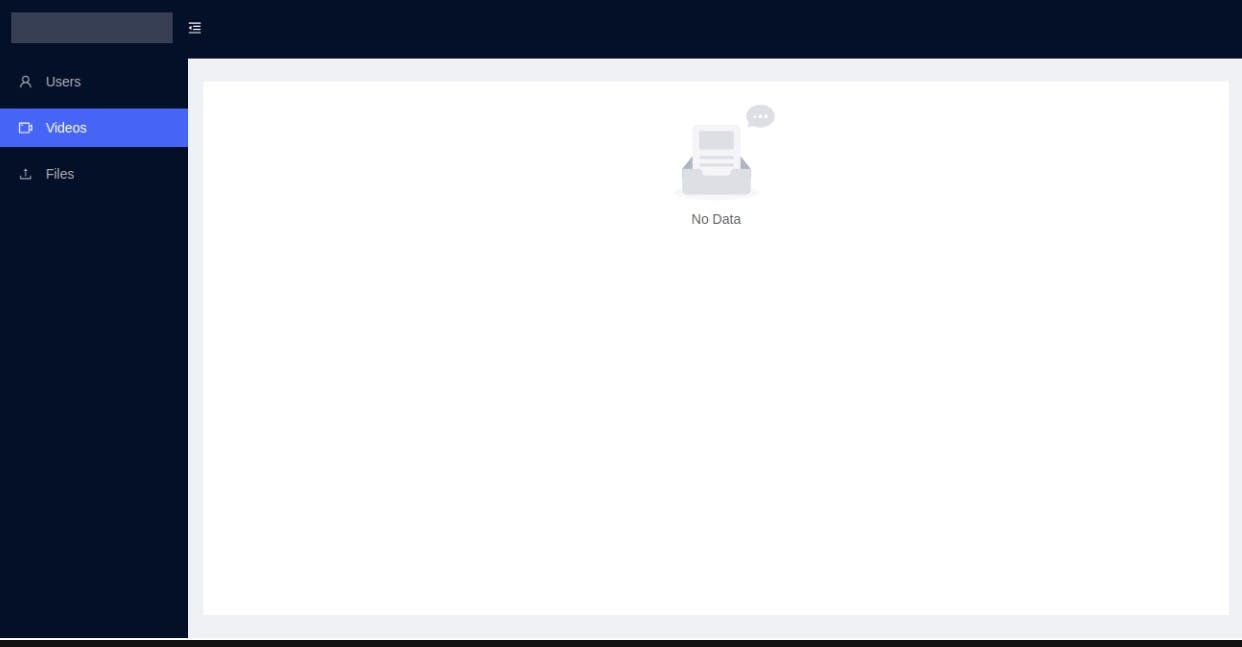
Using the Empty component, we will be adding two more pages files.tsx and videos.tsx with no data. You can implement Empty component as given below.
The videos page looks like;
//src/components/pages/videos.tsx
import React from 'react';
import {Empty} from 'antd';
const Videos = () => {
  return (
    <div>
        <Empty />
    </div>
  );
}
export default Videos;
Also the files page looks like;
//src/components/pages/files.tsx
import React from 'react';
import {Empty} from 'antd';
const Files = () => {
  return (
    <div>
        <Empty />
    </div>
  );
}
export default Files;
Demo
Checking our system perform as expected, please make sure that our Front end and Server is running properly. Run react project with following command if you haven’t done yet;
npm start
Also make sure our json server is working perfectly;
json-server --watch server/db.json
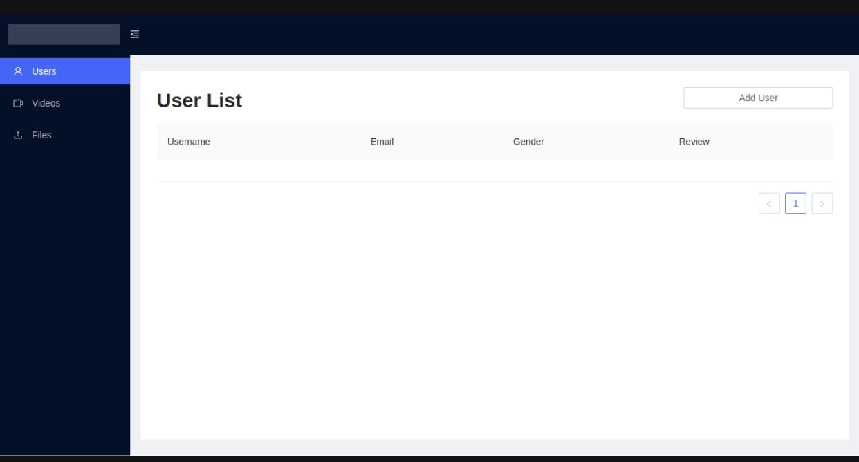
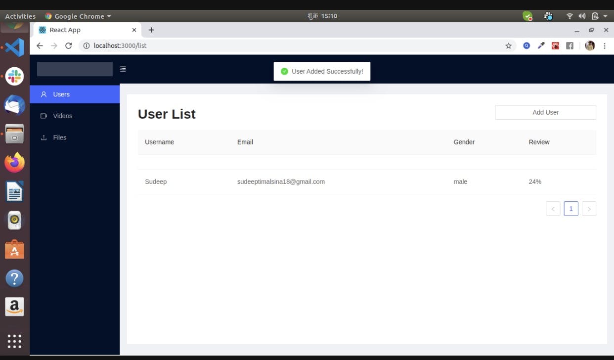
Boom! You will get an empty user list with a beautiful layout and bunch of menus on the sidebar. It looks cool!
Navigate to Add user and you will get the user form below. It looks more cool!
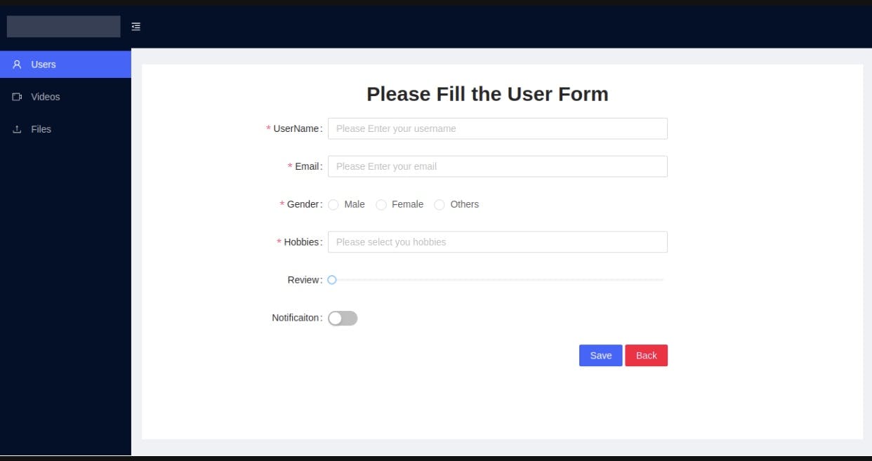
Now fill up all the fields and click save or click back to navigate to the list page. You will see the loading on save button until the form gets submitted. Lets see how it looks like;
This is how you can add new users. let’s see our empty components by navigating to videos from left menu as shown below.
We implemented some of the basic components of Ant Design with React. There are more components and designs provided by Ant. It is easy to use and much efficient for user experience. You can add more attributes to the application we developed just now, using other Ant Components. I will provide the code in my GitHub below. Stay Tuned for more practical React articles!